One Room Challenge Reveal - Week 6
Looks like we made it...we can officially add “One Room Challenge” to our resume…woot woot!
Even though our house is only 2.5 years old, the master bathroom needed a makeover, desperately! The fixtures - except for the shower - were crappy builder grade, the vanity was super low, no drawers, the toilet was child size/height, it was just alllllll wrong! Take a look for yourself….
Here was our game plan:
Remove old vanity (and repurpose as work bench)
Remove single sink (and donate) and re-plumb for 2 sinks
Remove single vanity light and re-wire for two separate vanity light fixtures
Wallpaper accent wall
Paint walls, ceilings & baseboards
Replace toilet
Now this might sound easy to everyone else but we have never done plumbing of this magnitude before so it was a HUGE undertaking for us. I should clarify it was a huge undertaking for my husband but I supported him every step of the way! Honestly, I could not have done this project (or any project really), without him, he’s definitely the best, he supports me and every crazy idea I have!
I also need to give a shout out to all of my incredible sponsors, they’ve all been linked and tagged below, without them, this project would not have been possible and because of them our master bathroom went from drab to fab in a few short weeks.
Ok here goes nothin’!
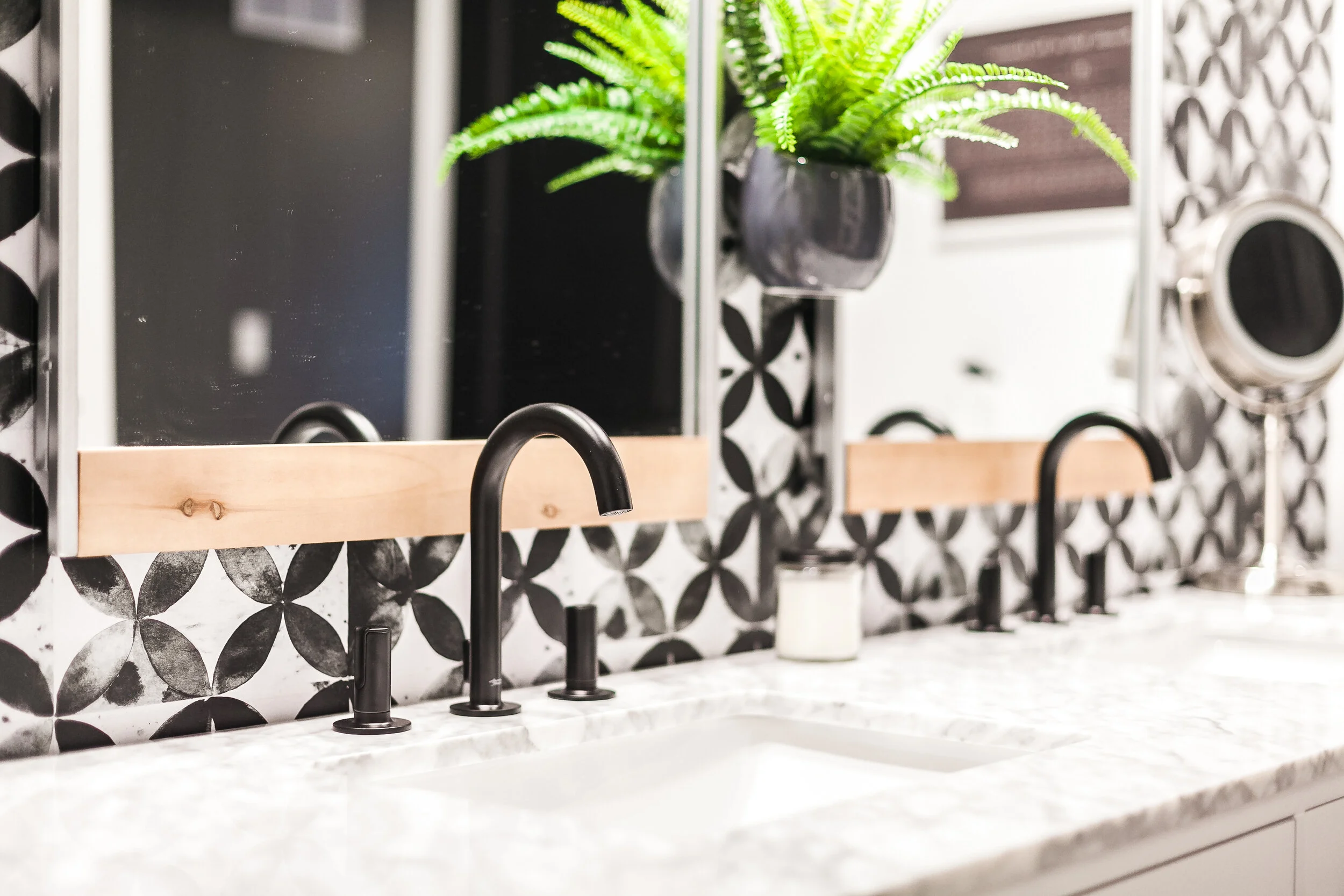
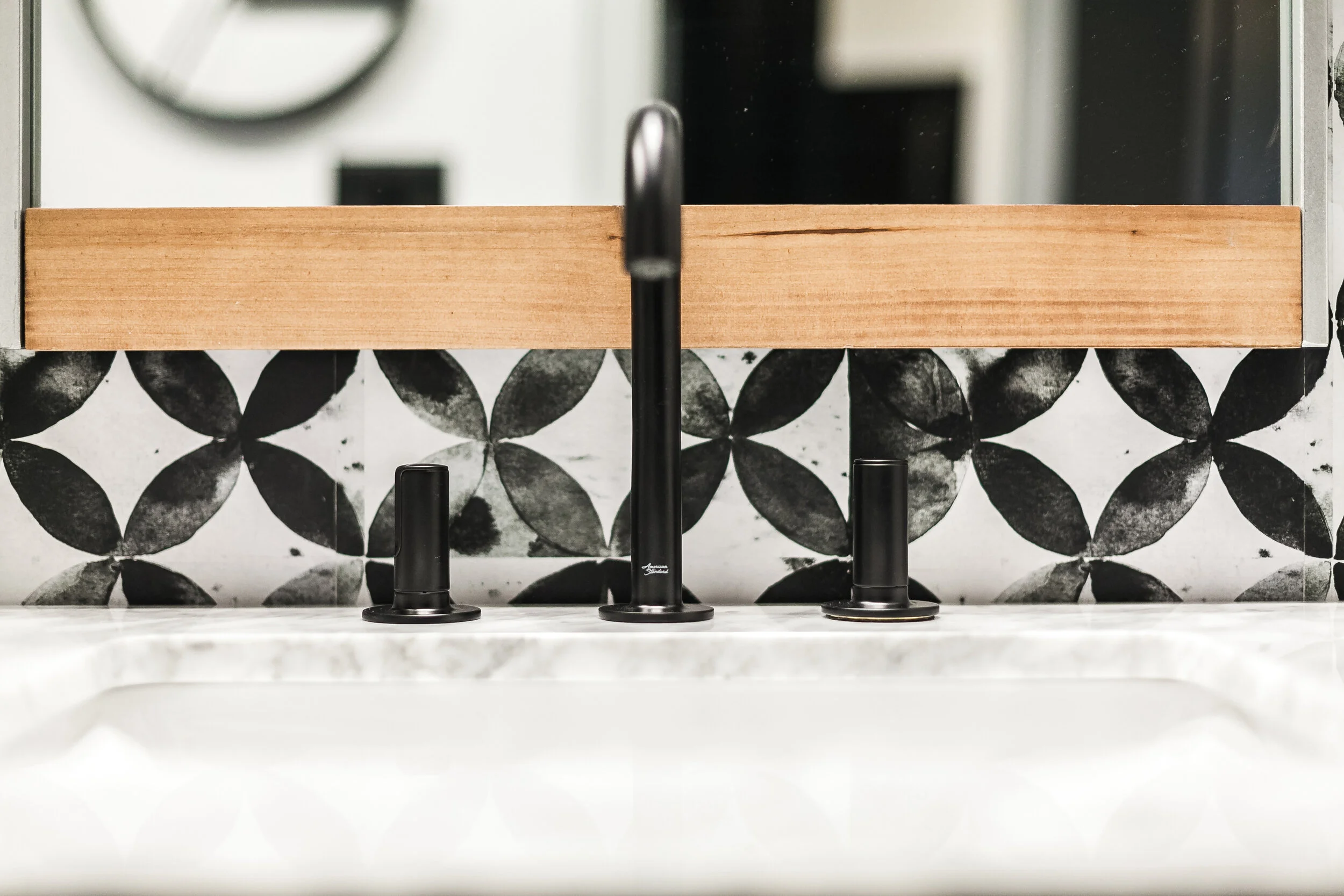
First up have our new vanity that is the perfect height with soooooo much storage, double sinks which means double beautiful matte black faucets that we are OBSESSED with. They are from American Standard’s Studio S Line and they are sleek and functional and certainly make a statement.
The vanity came with chrome drawer hardware which was pretty blah (in my opinion) so we choose these Soft Iron pulls from Liberty Hardware and they totally transformed the vanity. The marble countertop is beautiful and without even realizing it, we matched it perfectly to the marble in the existing shower. #winning
As I’ve been sharing sneak peeks of the bathroom I keep getting asked where we got the tile on the accent wall behind the vanity. You guys it’s not tile , it’s PEEL AND STICK WALLPAPER! OMG!!!! I know, I still can’t believe it either. It’s from Roommates Decor (where all my peel and stick wallpaper comes from) and is part of their new Paul Brent line. Isn’t it stunning? And it definitely resembles tiles, in fact it is called “Moroccan Tile” and for you colour loving people, it also comes in a beautiful dark green or a vibrant blue.
The other walls have been painted my new fave shade of white “Cotton Ball” by Behr Paint®,. The doors “Limousine Leather” and the ceiling I decided to paint the same colour as the walls in our master bedroom, “Mined Coal”. All by Behr® and the colours blend perfectly with the wallpaper.
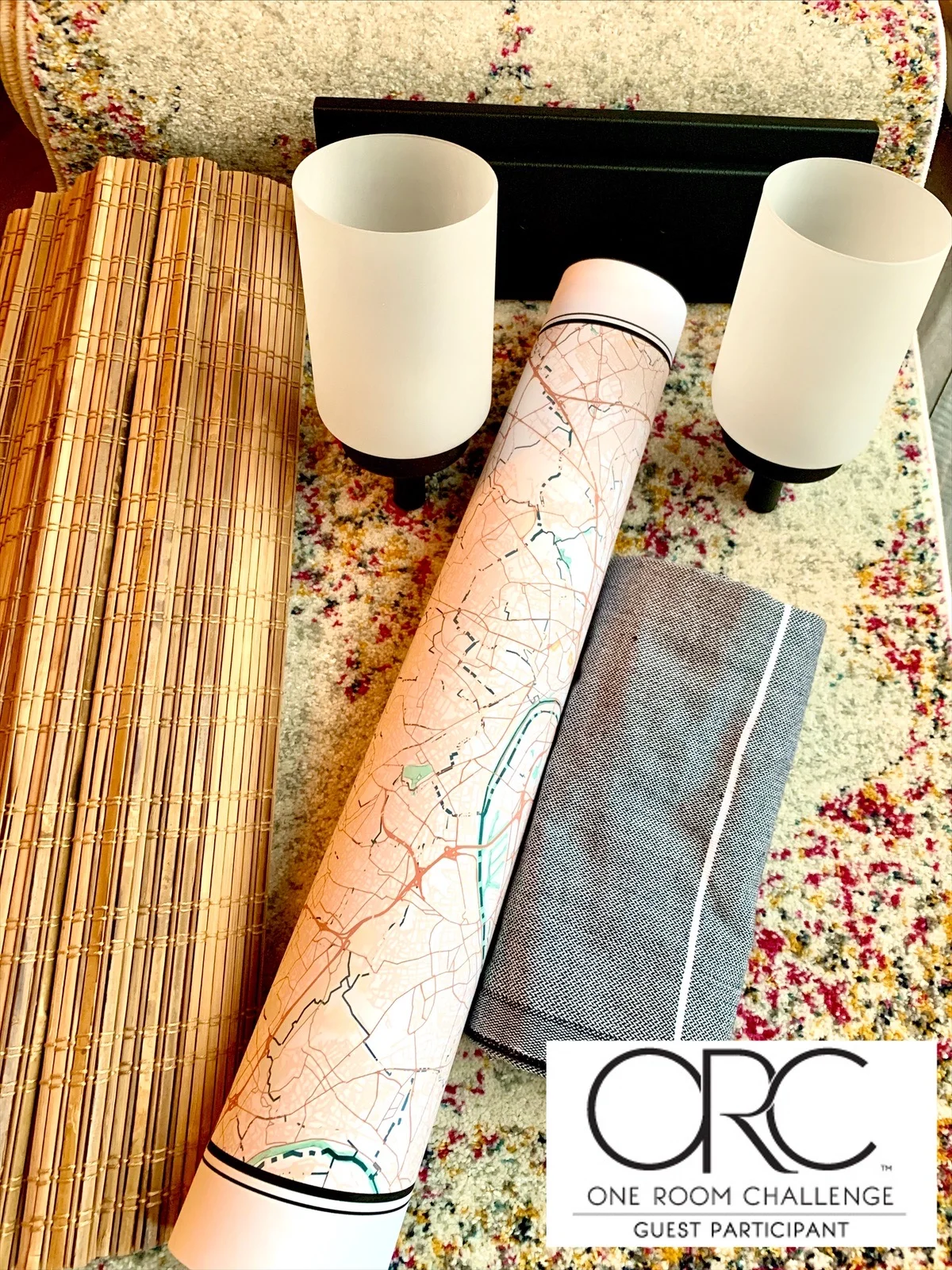
Now can we all take a moment to admire those gorgeous light fixtures? We went from the ugly builder grade single vanity light to these two soft iron fixtures from LivingLIGHTING Canada. They are stunning! I was concerned our monochrome bathroom was feeling a little too cold and modern but as soon as we installed, these light fixtures, they added the perfect touch of rustic. And can I just say, having two light fixtures provides the absolute perfect lighting for hair and make up!
And let’s not forget about our new Flowise Toilet from American Standard Canada. Who knew I could be so happy about a toilet? It is the right height, the concealed traps not only make it estheically pleasing, it makes cleaning a piece of cake. This toilet is definitely the throne in this little castle!
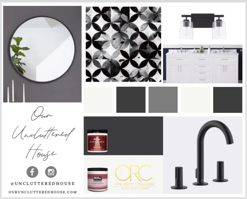
I went totally off track from my original plan for mirrors. If you look back at my Mood Board you will see I was planning for two round black mirrors but as the room came together, I decided I needed to add a little more texture to this space. After a day of mirror shopping I stumbled upon these “Addison” mirrors at Lowe’s and knew they were perfect, especially paired with the new bamboo Roman shade. Combined they totally softened the room.
For finishing touches we customized a map from Mapiful. This one has special meaning as it’s where my husband (and his family) was born and raised. I also chose this gorgeous vintage-y runner from Wayfair to add another subtle pop of pink. The Turkish towels, bath robe and hooks, also from Wayfair, are the perfect finishing touches. We also hung our rustic-y Periodic Table of Elements, also by Roommates Decor - yes they do wall hangings now. I love thinking outside the box and tables, charts and maps are my faves.
There were times we were ready to throw in the towel, the plumbing was more than we were equipped to do, but I am happy to say we stuck with it, we completed the room in four weeks instead of six and we did it ALL OURSELVES! Not a single bit of outsourcing was needed and that is something to be proud of!
This will be our last project for awhile because our house went on the market this week. This was not part of the plan when we signed up for the One Room Challenge but life happens and sometimes you just have to roll with the punches. We are sad to say goodbye, especially to this beautiful bathroom, but know someone will come along and appreciate all of our hard work and love it as much as we do. And who knows, maybe wherever we end up next there will be a room or two that need a little updating :)
Be sure to check out, not only the 20 featured One Room Challenge designers, but the 100’s of Guest Participants like myself who participated in the Fall ORC, you will be amazed and inspired!
Thank you for following along and cheering us on, the friendships and support amongst all the fellow One Room Challenge warriors is one of kind!
And you never know, maybe we will all meet again in the Spring One Room Challenge, just don’t tell my hubby!
Michele
xo


